How Bad Would It Have to Be?

•February 6, 2013 • 4 Comments

goneFishingI would like to humbly suggest that we are in denial. I’m talking about myself and my doctor/scientist friends, and I’m talking about publication bias. Those of us who have done research understand the basic dilemma. Negative findings are not sexy. They don’t sell. They don’t get published in good journals. In a sense, that’s reasonable, because there are a million uninteresting reasons why any experiment might not produce an effect. Whereas the whole idea of a properly controlled experiment is that, if it produces an effect, there are only a few (or ideally, one) possible explanations. Naturally we would be drawn to those experiments. Because we are early in our careers, many of us have had the opportunity to do at least some relatively speculative, hypothesis-generating (rather than hypothesis testing) research. That means we’ve been allowed to pursue the experimental paths that bore fruit.

But what about clinical research? Trials of medications and medical devices must include negative results, or the entire game is rigged. If pharmaceutical companies and manufacturers can selectively publish only the findings that make their products look effective, then we learn essentially nothing from those studies. Let’s say we calculate some basic metrics: the ratio of studies with positive findings that are published, and the ratio of studies with negative findings that are published. Here’s where I think the denial comes in. I want you to take a moment and think those numbers would have to be for you to get really concerned about the basic legitimacy of the research….I’ll wait…

So what are your numbers? How much publication bias are you willing to tolerate in the process that determines the medications you take? Those that you prescribe your patients? Those you give to your children? What about the medical devices implanted in your parents and grandparents?

A study from 2008 in the New England Journal of Medicine used trial registration records and FDA findings to determine these numbers for 12 antidepressant medications. The researchers reviewed 74 studies (representing more than 12,500 patients) and found that all but 1 of the 37 studies viewed by the FDA as supporting the effectiveness of the drug were published. The path to print was more arduous for those studies the FDA deemed to have negative or questionable results. Of the 36 trials, only 3 were published directly, 11 were published in way the authors said conveyed the results as positive, and 22 were not published at all. Meta-analysis suggested that the exclusion of the negative findings inflated effect sizes by 32%.

While this is only one study, and antidepressant trials commonly have relatively thin margins between effects in controls and in treated subjects, other research has suggested that the trials are like cosmic dark matter of biomedical science, a huge mass of missing data most notable in its absence. As Ben Goldacre points out a recent OpEd in the New York Times (and in a new book), the regulatory fixes that were meant to expose these trials have often failed to bring the intended transparency to the process. Furthermore, because many of the medications we use today rely on trials that were conducted before these rule changes, it will take years of strict compliance (so far, elusive) before we can be confident that we aren’t being hoodwinked by the most elementary of statistical shenanigans. For this reason, Goldacre has been championing alltrials.net, a petition campaign to rally support for retroactive registration of the thousands of missing trials. Amazingly, GSK (GlaxoSmithKline) has even committed to supporting the campaign (and to data transparency in general). Perhaps this is a signal of a nascent consensus.

To be clear, I’m not anti-pharma. Some of my best friends are pharmaceuticals. I’m just hoping to get beyond the need for self-delusion.

A Window into Data Transparency

•February 1, 2013 • 5 Comments

Main

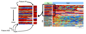
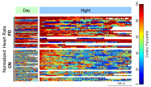
Here is my own experiment in data transparency in data visualization. It’s from a paper of mine on a disorder called familial disautonomia (FD, in the figure).  The paper compared physiological variables from 25 children with the disorder to 25 age/gender/race-matched controls (CN) based on in-home EKG and respiration recordings. The figure is rather dense, so by way of explanation I’ll break it down. There were recordings done during the day (left) and night (right), for the two sets of subjects (upper and lower blocks).

block

The multicolored blocks are representations of the heart rates for all of the children in the study for all of the time they were studied (abscissa). For the day studies, each child had two studies of two hours each, which are shown as two color bands within each block. There was only one night study for each child, so in that block each band is twice as tall, but each subject’s two daytime bands are adjacent to his/her nighttime band. In addition, in all four blocks, the youngest patients are arrayed at the top of the block, and the oldest at the bottom. Missing or artifact data epochs are shown in white. The colors themselves indicate the heart rate of that child coded as a percentile of his/her matched control (thus, self-normalized for the control children).

breakout

Leaving aside the clinical interpretation of the data in terms of the particular pathology, my goal with this figure was to be as forthcoming as possible in showing all the data, warts and all. This required some compromises. The normalization to control values was needed because the absolute heart rate values were too different to be represented on a single color scale. This means that absolute heart rate is not represented, and high or low rates outside the control distribution saturate to the ends of the color map. Also, the full temporal resolution of heart rate changes can’t be represented at this graphic resolution, so information about high frequency heart rate variability is lost in this figure.

I haven’t seen this kind of presentation of data in many physiology papers, though similar figures are often seen in omics research. My goal was to show as much of the heart rate data in as much detail as possible, including covariates that were not specifically addressed in the results (like age). Aside from the general incentive for transparency, meant to let the reader to assess my conclusions, I hoped that this format would allow readers to engage their own hypotheses with a large dataset. Of course, this openness also exposes the data to a level of scrutiny that could be avoided with summary statistics. The readers can see exactly how much data had to be thrown out, for better or worse.

I’m curious to know what people think of this approach. Is the goal of transparency reasonable, or is this data-dense figure more of a distraction?

Science Under Siege, or Just Paranoid Declinism?

•January 19, 2013 • 2 Comments

I wrote a somewhat meandering post about truth and politics over on my other blog. I’d be interested if any of my colleagues find these issues compelling at all.

As scientists, do you feel under threat from wide-spread ignorance? Does it bother you that so many people believe in creationism, or the Mayan apocalypse, or the gambler’s fallacy? Is it a threat only to our livelihood or do you worry for the fate of the species?

Or am I painting with too broad a brush? I’ve known many scientists who were theists, and some who are at least skeptical about global warming models. Does pursuit of the scientific method or critical thinking just create an orthodoxy of empiricism that is tantamount to religious faith?

Is Peer Review Broken?

•January 5, 2013 • 2 Comments

In A Jury of our Peers, a post on the parallel blog Nucleus Ambiguous, I introduce two web sites which highlight scientific fraud and error (Retraction Watch and Science Fraud. Update: Science Fraud has now closed due to legal pressure). One interpretation of the high number of entries posted on these blogs is that the current system of quality control, relying as it does on the process of peer review, is in need of serious reform. Not coincidentally, these sites also hint at the possibilities of using new media and crowdsourcing to increase transparency and accountability in scientific research.

One element of the peer review process that is often criticized is the opacity of the process, centering as it does on the presumed anonymity of the reviewers. The frontiers family of journals have provided an existence proof that a more open evaluation system can produce high quality, high impact, research.  One recent paper in Frontiers in Computational Neuroscience suggests that, at least among those committed to the basic reform, a rough consensus is emerging about the features of the new approach. The key elements are transparency, identity-verified reviewers, and integration of Web 2.0 elements like user-defined ranking systems. Even the journal Nature conducted an open review trial in 2006, but the editors found the reception from authors lukewarm.  Of course, scientists who are even in the running for publication in that prestigious journal may have less incentive to mess with the process.

Personally, my publications have all been reviewed with the traditional anonymous process, and I’ve certainly had at least one reviewer who I felt would have been compelled to provide a more thoughtful response if he or she had been identified. I do worry somewhat about exposing my manuscripts to public review, not because I have anything to hide, but because constructive peer review has often improved my work considerably, so I’d prefer to not have the less compelling drafts shadowing the final version (whatever that comes to mean in science 2.0 terms).

Aside from showing how the sausage is made, a much more fundamental question about the effects of open evaluation is whether identifying reviewers would discourage candid responses. This is not just a question of reducing the quality of individual papers, it also could lead to cliquishness and groupthink as each review is incorporated into larger social networks.